Exterior Colour Favourites 2025

Which exterior colour schemes will suit your home? Is grey really out? Should you go traditional or bold? If you’re thinking about repainting your house this year, then you’ve almost certainly thought about these colour questions. Paintway has researched the colour forecasts of industry experts to bring you our top 2025 exterior colour schemes.

1. Warm Neutral Exterior Colour Scheme 2025

Colour experts love warm neutrals for the way they accentuate earthy tones around a home and create a sense of natural serenity. Warm neutrals, like beige, blend beautifully with natural stone, render and landscaped gardens to create an elegant, cohesive look.  The secret to a beautiful earth-toned home is incorporating different textures, like painted brick, stone, timber and cladding, to give the neutrals depth. Pairing natural hues with white accents can add sophistication and contrast to the overall look and make your home feel like a sanctuary.

These colours has a subtle warmth and features calming neutrals.

2. Grey & White Exterior Colour Schemes 2025

While grey is no longer the ‘go-to’ exterior colour, it doesn’t seem to be going away. Grey has proved its longevity and versatility as it suits almost every style of home. However for 2025 exterior colour schemes,  designers are favouring soft greys that are cloud-like and natural, along with warmer shades with green undertones.

Soft grey paired with white trim is a timeless exterior colour scheme that highlights the architectural details of traditional weatherboard homes and adds a touch of elegance.

Exterior Colour Scheme - Grey - Three Birds Renovation

Dulux Pozieres Exterior Colour Scheme

3. Soft White and Cream Exterior Colours

Shades of white and cream continue to be popular exterior paint colours. An all-white exterior colour scheme suits coastal style homes and Queenslanders that have architectural details which add texture. Paired with light natural materials, a soft white scheme can create a fresh, airy feel that’s both timeless and modern.

In 2025, the cooler Hamptons whites have moved to softer tones that look more restful and visually calm. And while there’s no such thing as a single shade of white that suits every house, great examples of soft whites are Dulux Dune which looks sophisticated when paired with stone, and Snowy Mountain White.

4. Blue Exterior Colour Schemes 2025

Blues have long been popular with homeowners who are looking for a bold exterior colour scheme. In 2025, we seem to be moving from the deep dark blues to the mid-tones as we become more conscious of climate change and maintenance issues. While deep dark colours are striking, they absorb heat and can make your home hotter. On the other hand, pale colours reflect light so they’re cooler but they show the dirt and need more frequent cleaning.

Mid-toned grey-blues strike a good balance. Grey blue colours like Justice and Puhoi from the Dulux are not only low maintenance, but also look calm and sophisticated. And if you like a bolder contemporary look, pairing grey-blue weatherboards with a bright door will really make your home stand out.

Grey-blue exterior colour schemes 2025

Dulux Puhoi blue exterior colour scheme

5. Green Exterior Colour Schemes 2025

Green is loved for its versatility and remains a popular choice for an exterior colour scheme. In 2025, choose from earthy olives, smoky greens, muted sages and sea greens. Whatever your preference, the key for a successful green exterior colour scheme is using muddier or greyer versions of natural greens.

If you want to draw on your home’s surrounding leafy landscape, nature-focused greens will likely appeal to you. Taubmans Grounded Colour Palette has some lovely muted green shades like Footpath & Longhedge (similar to the house colours below) that can work beautifully on traditional and modern weatherboards homes.

2025 Door Colours

While it’s hard to top classic schemes like warm whites, light greys and beiges, you can easily dress up these safe choices with an accent colour for your front door, handrails, letterbox and acessories.

Exterior colour schemes in 2025 are set to feature front doors in pastel and mid-tone shades of lavender, dusty pink and coral. These are great for giving coastal homes and Queenslanders extra personality and charm. For a bolder look, bright accent colours like deep pinkish-reds, spicey paprikas and vibrant red-oranges are favoured. Along with these sunset hues, sky blue and jade green are expected to be statement colours. The monochromatic black and white color combo (white with black door and trim) also remains perennially popular, stylish and sophisticated.

House Colour Trends for 2025 😀

Another year is coming to a end for Paintway but we have yet again scoured the internet and we are feeling really inspired and share some predicted colour trends for homes in Australia 🇦🇺 in 2025.

1. Earthy Tones

Warm Neutrals: Shades like terracotta, warm taupes, and soft browns are becoming increasingly popular as they create a cozy and inviting atmosphere.

Natural Greens: Colors inspired by nature, such as sage green or olive tones, promote tranquility and a connection to the outdoors.

2. Bold Accents

Vibrant Hues: Rich colours like deep blues (navy or cobalt), emerald greens, or spicy reds may be used as accent walls to add drama to spaces

Statement Colours: Bright yellows or oranges could emerge as playful accent colors that bring energy into home environments.

3. Soft Pastels

Muted Shades: Soft pastels such as blush pinks, light lavenders, and pale blues offer a refreshing take on traditional lighter shades while adding warmth.

Vintage Vibes: These colors can evoke nostalgia while fitting seamlessly into modern designs.

4. Monochromatic Schemes

Using varying shades of one color can create depth without overwhelming the senses—think layers of greys or subtle variations of blue.

5. Textured Finishes

Beyond just color selection, finishes that incorporate texture (like matte vs glossy) may gain popularity to add interest to surfaces without relying solely on dramatic hues.

6. Sustainable Choices

Eco-friendly paints with natural pigments may influence both colour choice and product selection among environmentally conscious homeowners.

What will be your choice or what would you like to see in Colours in 2025?

Let us know!

Tips For Choosing Exterior Paint Colours

Choosing the right exterior paint colours for your home can be tough but at Paintway, we aim to make the process less challenging. We have been painting Toowoomba homes for over 30 years, so we’ve seen what works and what doesn’t when it comes to colour. As a local painting business, we’re aware of the huge difference the right exterior paint colours can make to your home’s street appeal. We also know the worry (and sometimes family disagreements!) choosing colours can cause.

So is there a way to get your exterior paint colours right? The answer is YES. We have assisted many customers to achieve a result they love and add value to their homes. We offer free colour consultations with full repaints, but if you’d like some insight now, here are 5 tips to help you get started on exterior paint colours for your home.

1. Identify the style of the neighbourhood

Use the style of surrounding homes in your neighbourhood as a starting point to choose the right exterior paint colours. If traditional Queenslanders dominate the area, it’s safer to go for a more traditional scheme. If the neighbourhood contains more modern homes, bolder colours or accents may work well. Choose colours that complement (not clash with) your neighbours’ homes but are not exactly the same so you subtly set your house apart from theirs.

Exterior paint colours in Brisbane neighbourhood

Neutrals and grey-toned pastels suit traditional neighbourhoods

2. Trust nature’s colour combinations

The surrounding landscape can give clues about what paint colours will look good on your home. Is it predominantly cool green with sandy neutrals or more warm earthy tones? Are you surrounded by vibrant tropical foliage or in a more urban area? Taking your queue from nature will generally lead you in the right direction for choosing the best exterior paint colours.

Exterior paint colours - earthy

Natural and earth-toned colours look great against native plants and foliage

3. Look to your home’s features for guidance

The existing colours in or outside of a home, such as the foundation or the roof should influence your choice of exterior paint colours. Don’t go for a trendy colour that doesn’t complement what’s already there. For example, if your home has a red roof, choose warm neutrals (not cool grey-toned ones) to complement it. If you have a Queenslander with beautiful decorative features, highlight them with a contrasting darker or lighter colour.

Exterior paint colours - tip - match your roof

Creamy whites with warm dark accent colours complement and balance this home’s red roof

4. Offset dark with light exterior paint colours

Dark colours make a bold modern statement but too much exterior dark paint can make a home look small and gloomy. On traditional homes especially, make sure to offset dark hues with whites on trims, verandahs and other accents. Light colours typically make a house look larger. However, if you are you are on or near a busy main road and have pollution to deal with, you’ll need to consider practicalities – white will not be the best choice!

Exterior paint colours tip - black charcoal with white

White horizontal and diagonal accents add interest and make this home look bigger

5. Observe exterior paint colours in different lights

Light can play a big role in choosing the right exterior paint colours. How will the colours you choose look in bright sun versus a cloudy day? You should also consider which direction your home faces. If it’s west facing, colours will look brighter and more intense. Bright white would be too glary, but a light colour generally will reflect heat and last longer than dark, heat-absorbing colours.

Exterior paint colours tip - western aspect

A light neutral will work better than all-white if your home faces west and gets a lot of direct sun

Steps To Choose Exterior Paint Colours For Your Home

When you engage us, our Step-by-Step approach to colour decision-making will ensure you get the result you envision.

  • Step 1 Take advantage of our practical guidance when one of our master painters comes to your house to quote. Advice at this early stage can help you understand which colours will handle any heat, sun, or pollution that your house may be subject to.
  • Step 2 Once you engage us for a full interior or exterior repaint, we’ll arrange a free professional colour consultation for you. There’s no substitute for an onsite visit by a qualified colour professional to advise on exterior paint colours for your home in person.
  • Step 3 Finally, make sure to buy sample pots and apply samples of paint on different parts of your home. This is a crucial step that should not be skipped. You need to know how a colour will look over different base materials (eg weatherboards, woodwork or render) and in different lights to confirm your choice. We’re happy to assist with this if needed and guide you through final decisions on shades and finishes.

We’ve found this process delivers beautiful results every time. So if you’d like to begin the process of choosing your perfect colour scheme, contact Paintway Toowoomba Today!

Expecting? Picking a Colour for the Nursery

With so many colours to choose from we just love a Mint Green and Neutral soft tones for a baby's nursery. They are amazing colours when you do not know the gender of your upcoming new arrival. Keeping the furniture in similar tones these colours are a perfect match for any Baby Boy or Baby Girls Nursery. When choosing colours, its important to take your cues from the existing space. You may love deep rich colours but dark hues absorb light and can easily overwhelm a small room. Light colours, on the other hand, make a room appear bigger and brighter. Taking the room’s needs into consideration beforehand is the best way to make the most of your space.

uuihiuhiuhiuhiuh

Green is Good For YouAmerican Psychological Association.When choosing a shade for your nursery, you can opt for light to medium greens in earthy hues like sage and moss. However, darker greens can also be implemented, particularly if they are balanced with lighter neutrals.

Christmas 2022

Have you completed your Christmas shopping? Paintway have been “wrapping up” (Pardon the Pun? hehe) all of our Christmas gift shopping over the past week, but I still have a few gifts left on my list. We have been so busy this month, it will feel great to have our shopping and gifts all set to go so we are ready to relax and enjoy time with family and friends.

Paintway would like to wish you all a very Merry Christmas 🎄 and would like to take the opportunity to thank you all so much for your business in 2022.

We would like to leave you with one more Painting Tip for the Year.

Thinking of painting your home and want to know the paint colour trends forecasted by the interior design experts for 2023? As professional  painters we see the trends and know what works. Trends in interior design are as cyclical as those in clothing and furnishings. The good news is that updating your walls is practically as simple as updating your wardrobe.

Its all about making Changing Colours inside your home can have a great impact on your mood. Which is precisely what is necessary as the world emerges from the pandemic’s gloom. It’s for this reason that one of the new colour palettes has been selected: to give us a much-needed boost of energy and positivity.

If you are planning a house makeover, ensure you hire a QUALIFIED Painter to redecorate the interior paint, if you are trying to decide what colour to repaint your newly constructed or renovated home, Just call us and we can help you with all those decisions.

Merry Christmas Toowoomba 🤶🏻

Exterior Paint Colour Trends To Make Your Home More Modern

The exterior colour of your house is absolutely crucial to the overall attractiveness of your house. With people’s tastes forever changing, it is important to repaint your house to fit new trends. When selling your house, it is important to give your house a fresh coat of paint- increasing the property value and overall appeal to buyers. The fresh residential paint symbolises to your buyers that you value and take care of your home- which means that if the property will maintain its value in future years.

However, with trends forever changing, it can often be difficult to decide what colours you should consider painting your home. We at Premier Painting, commercial painters based in Sydney, are leading the game in residential painting, with our top-notch quality and customer service. We understand the impact a coat of paint can make on your home and are truly passionate about our craft. We have created a list of trends in 2022 that buyers are looking for, and that you should consider giving a go!

Contrasting shades of grey

Often referred to as a timeless classic, by painting your home white, contrasted by two darker tones of grey, it gives your home a modern element whilst also retaining its character. Modern homes aim for a clean aesthetic, however, can sometimes come off as lifeless. By repainting your home with modern colours, it ensures that your home maintains an elevated look whilst maintain its classic features. To accentuate these features even more, you should highlight architectural details with the white, contrasting everything else with darker tones of grey. When using this type of colour palette, you should only use three to four different colours, as this achieves a more minimalistic and modern look.


Earthy with Warm whites

The main trends in 2022 are contrasting natural looking colours with white. Having colours such as wooden brown contrasted by a warmer white, gives your home an almost calming effect. Pure whites can often be too harsh in regard to exterior paint. On the other hand, a warm or shaded white plays into the natural element of the brown and gives off a more sophisticated look. These natural colours convey to others that your home is “cozy” and pairs perfectly for homes in the suburbs with more greenery around. You do not want your home to stick out from the environment but add to it.


Faded greens

Although painting your house in more pronounced colours may not be for everyone, for those who desire a dash of colour, a muted or faded green is the perfect trend to capitalise on. Faded greens pair perfectly with brick houses, that need a little bit of colour to accentuate its features. Consider painting your door or window frames- which, when complimented with the brick walls, highlights the surrounding environment.

How to choose the Right Colours for your home

What’s the most important role colour plays in a room?

It sets the mood for a room. The colour you choose is really about what you want the room to feel like.

Do you tend to use one colour throughout the entire interior, or mix it up room to room?

In general, I feel it’s important to have continuity throughout the entire house. I’ll use one or two colours throughout the house, and then mix in other accent colours. That gives continuity, but at the same time allows the various rooms to         have different personalities.

What kind of classic colour combinations do you think work best?

Blue and white, yellow and green for a kitchen, red and black for a very formal dining room. For a lounge, I would suggest chocolate brown and camel or dark green and navy blue. We like burgundy and khaki, navy and khaki, or dark green and khaki. And greys and blues look really great together.

What kind of guidelines would you suggest if someone wants to use bold colours?

You need to be aware that you will likely get tired of bold colours very quickly. If you really want to incorporate a strong, bold colour, use it as an accent. Bold colours are often attractive because they are the colour of the moment this can quickly date a room.

How should the homeowner account for different lighting in choosing colours?

Select three shades of the colour you want: where you think you want to be, and one shade lighter and one shade darker. Do this with paint, wallpaper, or fabric swatches. Put the samples in two places: next to the window and in a darker corner. Look at them at different times during the day and at night. Then make your decision.

Is a neutral colour scheme always appropriate?

No. It totally depends on the house, the location, the architecture, and the personality of the homeowner. It’s about trying to keep a balance. An entire neutral house can be boring.

How do you use colour to affect relationship and the relationship with other decorative elements?

Colour is key to how the decor is perceived. If it’s a big room, paint it a brighter, warmer colour to bring the walls in. Paint a smaller room a cooler colour to push the walls out. Colour also establishes visual weight and balance. If you put a bold primary-based piece of art in a pastel room, it’s probably not going to seem right. The colours of the art should balance the colours of the space.

What are the challenges homeowners face in choosing colours and colour schemes?

Sometimes people are scared of colour, especially dark colours. Ultimately, people should really follow their heart: If they love a colour, test it, and like it in place, they should not be afraid to choose it.

The Best way to colour match your walls

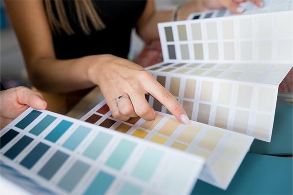
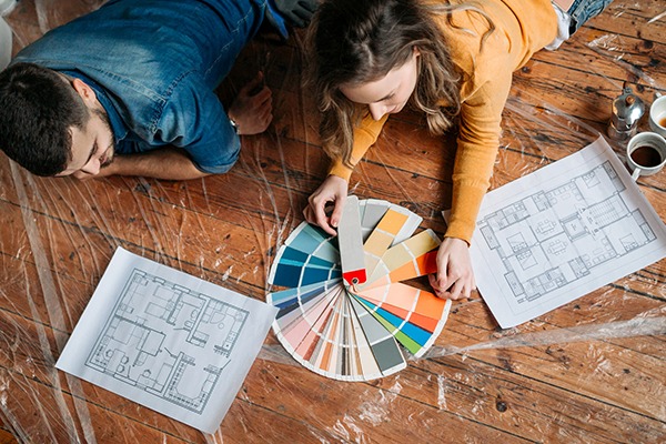
Deciding on a colour palette for a room can seem like a daunting task. Anyone who has undertaken it can relate to the experience of standing in front of a colour wall overwhelmed with choice – then leaving to realise the colour chips selected look very different when out of the florescent store lighting. Whether you are designing a space for a client, or trying to match an existing colour, here’s how to help ease your colour swatch pains with our colour swatching tips and tricks.

Come up with a plan

First things first, narrow down your colour short list before going to get your swatches. Having a plan will help reduce any confusion at the store. If you know the rough colour you want and just need to decide on the shade, start by considering how much natural light the space has, as this will help dictate the perfect shade for your room.

Take options

Give yourself some breathing space with a variety of shades, so you can nail your choice on your first trip to your local paint shop. This is especially helpful when you know which colour you want but are narrowing down the shade and tone. Visualising the different swatches against your wall will help streamline the decision process.

Create your own colour

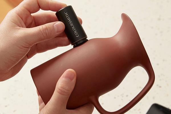
Have a colour in mind but can’t seem to find an exact match? Whether you have found the perfect colour in a painting, coffee mug or a cushion, take that colour into your local paint shop to do a colour match.

Colour swatches in any light

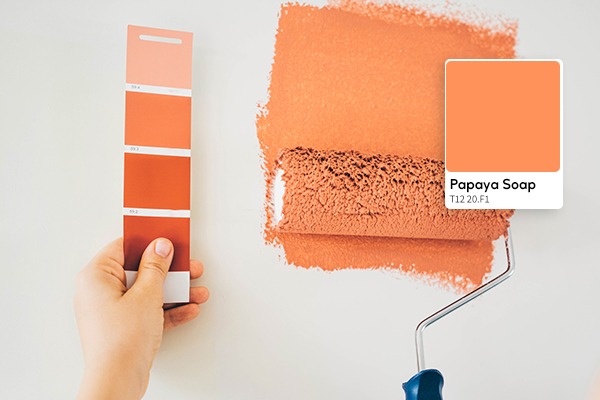
Struggling to see how a swatch will look in different lighting? Use the test pot to see for yourself how a colour will dry and look in your space’s lighting. If you don’t want to swatch directly onto your desired wall, you can paint on a piece of white paper. Trying out colours in your space at different times of the day and night will ensure you like the colour you are considering in all lights.

Soothing Colours for a good night sleep

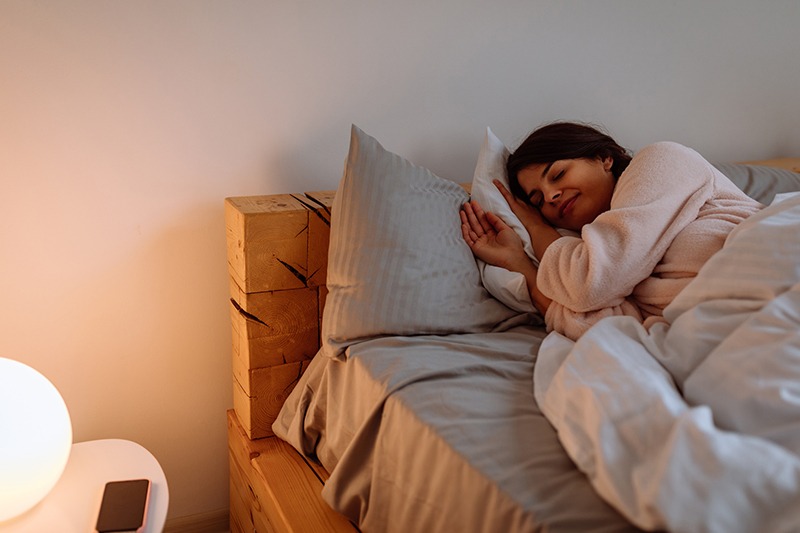
Sleep is a critical factor in maintaining our physical and mental well-being, so trying to optimise our sleeping environment is always a good idea. When designing the look and feel of your bedroom, you may jump at certain colours and shades based purely on their aesthetic appeal. While there is zero shame in doing this, if you are someone who struggles with getting to sleep, some colours can help you relax.

Don’t have time to study colour psychology in depth? Don’t worry because here’s a quick guide to which colours to use for your best night’s sleep.

Blue

The best colour you can use for your bedroom is blue. A range of studies has listed blue as the most calming colour due to its soothing effects on your heart rate and blood pressure. How does blue do this? Our eyes contain specialised receptors called ganglion cells that are most sensitive to the colour blue. These cells filter and send information to the part of our brain that controls your body’s 24-hour rhythm. A recent study of 2000 Travelodge hotels found that guests who woke up in blue rooms got the highest amount of uninterrupted sleep, compared to other colours at 7 hours and 52 minutes. This is impressive considering the average person rarely gets 7 hours of uninterrupted sleep.

While all shades of blue can evoke a relaxing mood, if you want to give the appearance of a larger room, opt for lighter shades on your bedroom walls and ceilings. We recommend colours like Taubmans’ Dim Night or Formosa Blue.

Green

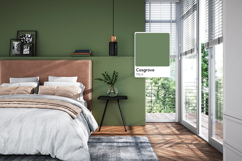
If getting out into nature relaxes you, why not incorporate nature’s tranquility into your bedroom colour palette? Creating a space that mimics nature is a sure way to tuck in and soothe yourself to sleep. Fresh greens are known to bring harmony to the room.

Avoid glossy paint

The sheen of your paint will play a major factor in terms of sleep quality – no matter which colour you choose. Anything that can reflect light and stimulate your sense will be a detriment to your sleep quality. An overly glossy finish can reflect light and stimulate your brain, so opt for a matte or low sheen finish instead.

Colour to avoid in the bedroom

As a rule of thumb, vibrant colours such as reds, oranges and loud pinks should be avoided in bedrooms. This is due to these energetic colours being stimulating to the eye. Some studies have shown that looking at the colour red increases your heart rate and adrenaline flow. In the wild, reds, oranges and yellows are considered dangerous colours and instinctually make us more alert when we see them – the last thing you want when you’re winding down for sleep. If you simply must have a vibrant colour, consider a more muted version.

If you’re trying to give yourself the best chance at a good night’s sleep, make sure you create a soothing retreat that isn’t overly stimulating to the eye. To create this sleep time oasis, seek out the relaxing blues, greens and matte finishes. Get creative and happy painting!

Working from home more often? Give your Office a New Lease on Life!

With working from home being the norm, we have the perfect guides to help you transform your space to be more effective. Whether you want to maximise productivity in your home office or set up an effective workout space in your garage, we have a few tips and tricks to transform your home spaces with colours that are designed to inspire.

Working from home has shifted from a temporary solution during the pandemic to a more permanent way of working. There has never been a better time to transform your home office into a welcoming and productive space. But what goes into setting up the ultimate home office? We break down what you can do to create your dream productive home office.

Pick your colour

Colour has been shown to have a significant impact on our mood and therefore our productivity when working. When selecting your new office hue, avoiding cool tones will prevent your office from feeling too clinical. If you want to take it a step further, consider the kind of work you do in your office. Highly saturated, bright colours are stimulating (perfect for creative jobs), while muted warm colours are soothing (better for jobs requiring high focus). Our top picks? Warm neutrals are a versatile way to soothe your mood, while easily complementing an array of colour palettes. We would suggest a warm grey-beige or a warm white colour. For something more eye-catching, opt for peach and soft corals. These colours are known to help improve focus and boost concentration and creativity.

Wanting something a little bolder than warm-neutrals? Highly saturated tones like jewel tones and earthy greens act as the perfect backdrop for inspiring creativity and maintaining focus.